

By Dave Dion-Labrecque - Updated July 2026 - 8 min read
A friend of mine keeps eleven small vinyl figures on the windowsill above her kitchen sink. None of them are worth much. She did not choose most of them; they arrived sealed in opaque boxes and she found out what she owned only after tearing the foil. When I asked her why they live above the sink instead of on a shelf, she said, without hesitating, "because I look at them while I do the dishes." That is the whole thesis of the blind box aesthetic in one sentence. These objects are not investments and they are not decor in any serious interior-design sense. They are companions with a purchase price, and the surprise is part of what makes them feel like they chose you back.
We have spent the last few months in our studio sculpting characters in that same visual language, and the deeper we went, the more obvious it became that this is not a 2020s invention. The blind box is only the newest container for something people have been doing for four hundred years.
The pocket-sized object has a very long résumé
Before the collectible figure there was the toggle. During Japan's Tokugawa period, merchants were barred from wearing jewelry, so they poured that suppressed decorative instinct into the carved ivory and boxwood netsuke used to fasten a pouch to a sash. Functionally these were buttons. In practice they became miniature sculpture: tanuki mid-mischief, skulls, wrestlers, animals caught in a gesture. People commissioned them from named carvers, argued about workmanship, and collected them in sets.
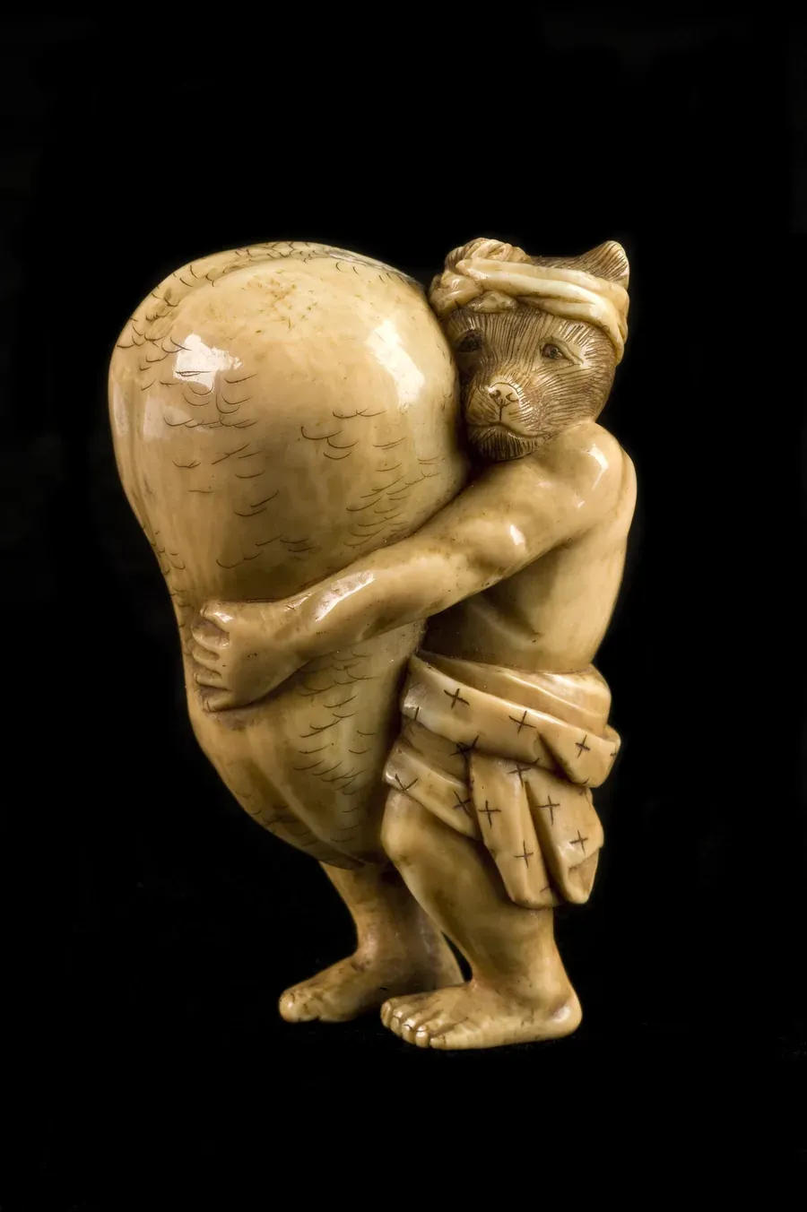
What strikes me about netsuke is not the craftsmanship, impressive as it is. It is the scale of the ambition relative to the size of the object. Someone spent weeks on a thing the size of a walnut, knowing it would be seen mostly by its owner, mostly at close range, mostly by touch. The modern art toy has inherited that exact proposition. Nobody across the room can see the paint separation on a three-inch figure. You can, from eighteen inches away, and that is the point.
Gashapon taught the world to pay for uncertainty
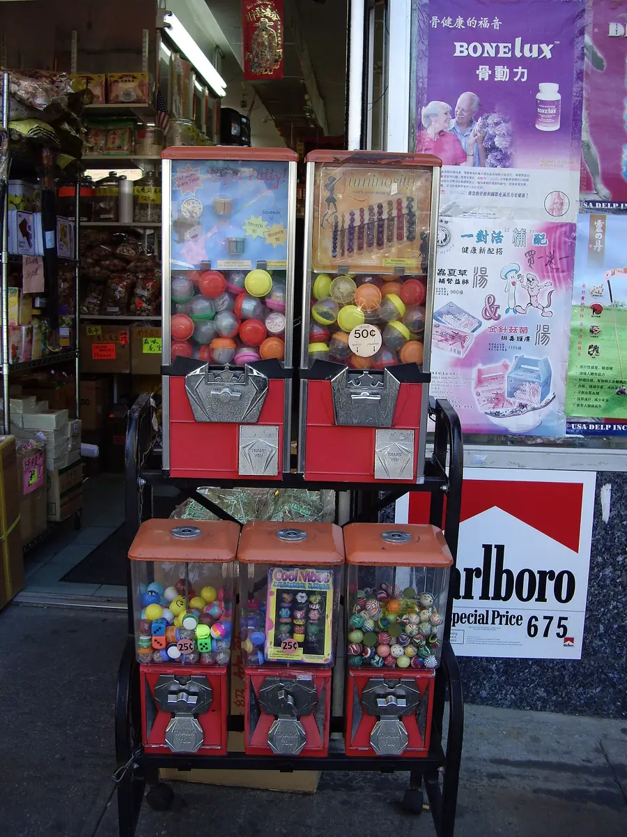
The randomness arrived later, and it arrived through a vending machine. Capsule toy machines landed in Japan in the mid-1960s, borrowed from American penny-gum dispensers, and by the late 1970s Bandai had turned them into a serious business with licensed characters inside the plastic domes. The Japanese onomatopoeia stuck: gacha for the crank, pon for the drop. Two syllables that describe a physical sensation, which tells you a lot about where the pleasure lives.
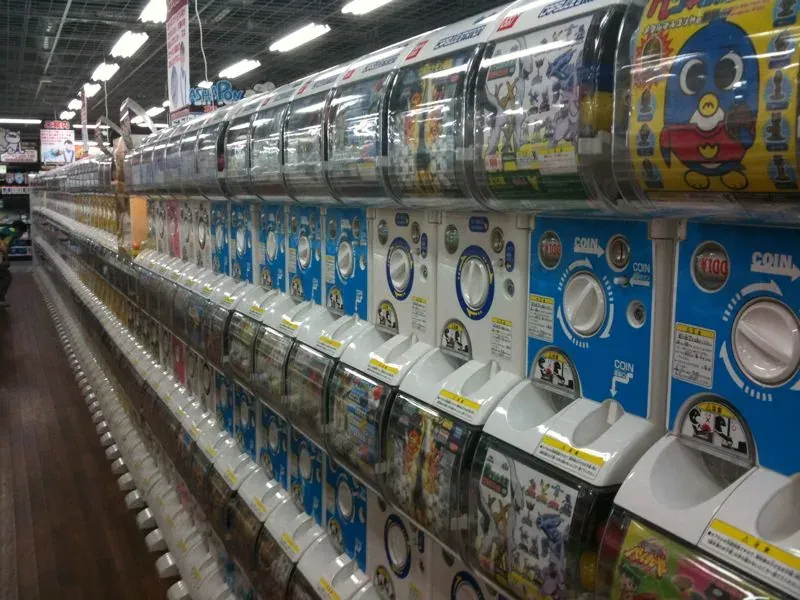
Walk into a Japanese station arcade and the machines are stacked eight high and forty wide, a full colour field of capsules. It reads as abundance, but the actual transaction is narrow and specific: you are not buying a toy, you are buying the four seconds between the crank and the reveal. The toy is what you are left holding afterward.
That structure went global with almost no translation loss. Kinder eggs, trading card packs, loot boxes, mystery bags at the counter of every gift shop on earth. The container changed; the four seconds did not.
The 1990s made the toy a signature
The thing that turned capsule randomness into a design culture was the arrival of authorship. In late-1990s Hong Kong, Michael Lau began building figures out of the visual grammar of skate and street culture, treating the vinyl figure as a medium rather than merchandise. Brian Donnelly, working as KAWS, released his first Companion in 1999. Medicom Toy's Kubrick line arrived around the same moment, and the first Be@rbrick was handed out at a Tokyo character convention in May 2001, a bear-shaped blank designed from the start to be repainted by other artists.
That last detail is the one worth sitting with. Be@rbrick was not a character. It was a canvas with ears. A standard silhouette that hundreds of designers could interpret, which meant collectors were no longer collecting toys, they were collecting artists. Kidrobot ran the same play in New York from 2002 onward with the Dunny and the blank Munny, and suddenly the category had what every real aesthetic needs: a shared form, an argument about who does it best, and a resale market that keeps score.
Museums caught up eventually. Young V&A in London, which holds one of the deepest toy and childhood-design archives anywhere, treats mass-produced play objects as legitimate design history rather than sentimental clutter. That framing matters, because it is the framing collectors were already using.
What the sealed box actually does to you
The psychology is not mysterious, and I would rather name it plainly than pretend the appeal is purely aesthetic. A blind box is a variable-ratio reward. You know roughly what you might get and you do not know which one, and that gap is the most reliably compelling structure in behavioural design. Researchers looking at the current wave have been fairly direct that the mechanics blind boxes share with gambling deserve scrutiny, particularly the chase for the rare "secret" variant that a series deliberately makes scarce.
I think both things are true at once. The mechanic is manipulative, and the objects are genuinely good. A well-designed figure survives the moment of unboxing and keeps earning its windowsill for years, which is more than most purchases manage. The honest position is to enjoy the design while staying clear-eyed about the slot-machine architecture wrapped around it, and to notice that the same cultivated-nonchalance economy we wrote about in the aura farming phenomenon is running here too. What you display signals something. The randomness gives you plausible deniability about having chosen it.
There is also a much older thread underneath. Small carried objects have functioned as talismans for most of human history, and the appetite for meaningful little objects you keep close did not disappear when we stopped calling them amulets. It just moved into vinyl.
Why 2026's version is soft, glossy, and slightly imperfect
Here is where the current moment diverges from the 2000s. The vinyl toys of the KAWS and Dunny era were hard-edged, matte, and often deliberately cool in temperature. What is dominating now is the opposite: rounded bean bodies, high-gloss surfaces with visible specular highlights, candy-saturated colour, and a texture that reads as squeezable even in a flat image.
Part of that is production reality. A lot of what circulates as art-toy imagery today never existed as a physical object; it was rendered. The tools that made that easy also pushed a specific look, and design writers have spent the past two years naming it claycore or claymorphism: soft organic forms, plasticine surfaces that keep their thumbprints, matte-to-glossy shading that suggests something hand-shaped rather than machined. It is an explicit reaction against a decade of flawless flat vector work.
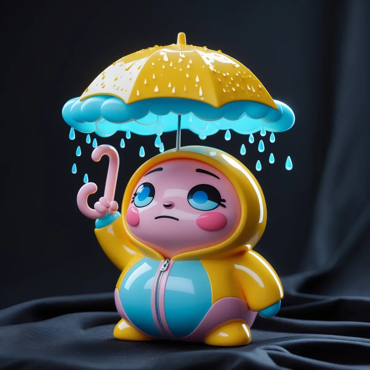
The other part is emotional. The breakout figures of this cycle are not aspirational, they are dysregulated. Crying, sulking, exhausted, anxious, over it. A generation that grew up performing contentment online has developed a strong appetite for objects that visibly are not coping, which is roughly the same instinct that made empty malls and abandoned websites feel comforting rather than eerie. The figure absorbs the mood so you do not have to narrate it.
If you want a working checklist for the visual grammar, it comes down to five things: an oversized head on a compact body, glossy or translucent material with strong highlights, a limited candy palette that stays saturated on dark grounds, one absurd narrative prop, and an expression that is specific rather than cheerful. Miss the last one and you have a mascot. Hit it and you have a character.
Where it likely goes next
Two directions look plausible from where we sit. The first is material honesty: collectors are already asking harder questions about eco-vinyl and about how many identical figures the planet needs, the same pressure that reshaped the fungi-forward corner of design. The second is that the aesthetic leaves the shelf entirely. Glossy character design has already migrated into knitwear graphics, phone accessories, nail art, and album covers, and the figure stops being an object you buy and becomes a style you wear.
That migration is the part that interests us most, because it is where a three-inch collectible has to survive being scaled up to twelve inches across a chest and printed on cotton. Not every design does. The ones that do tend to be the ones that were built around a mood rather than a gimmick.
From our studio
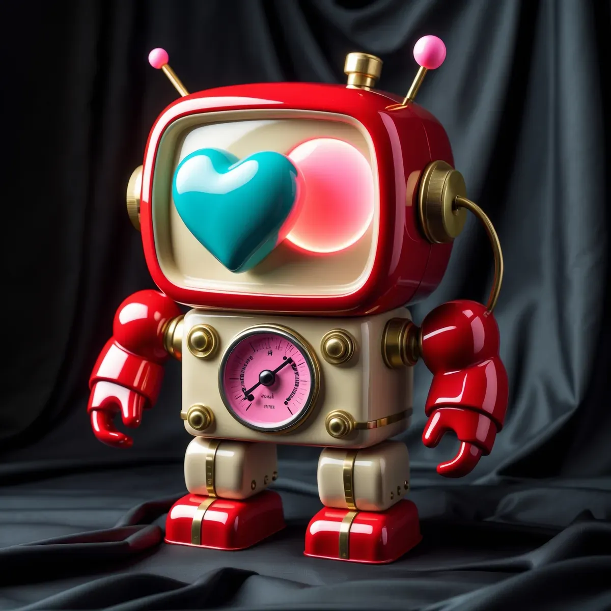
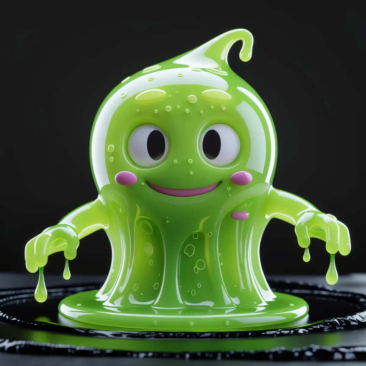
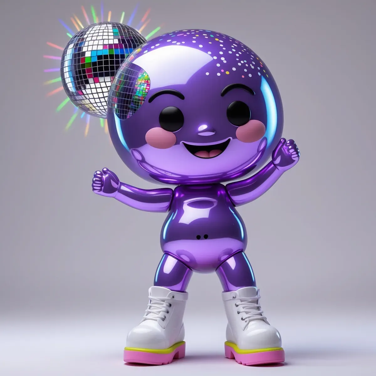
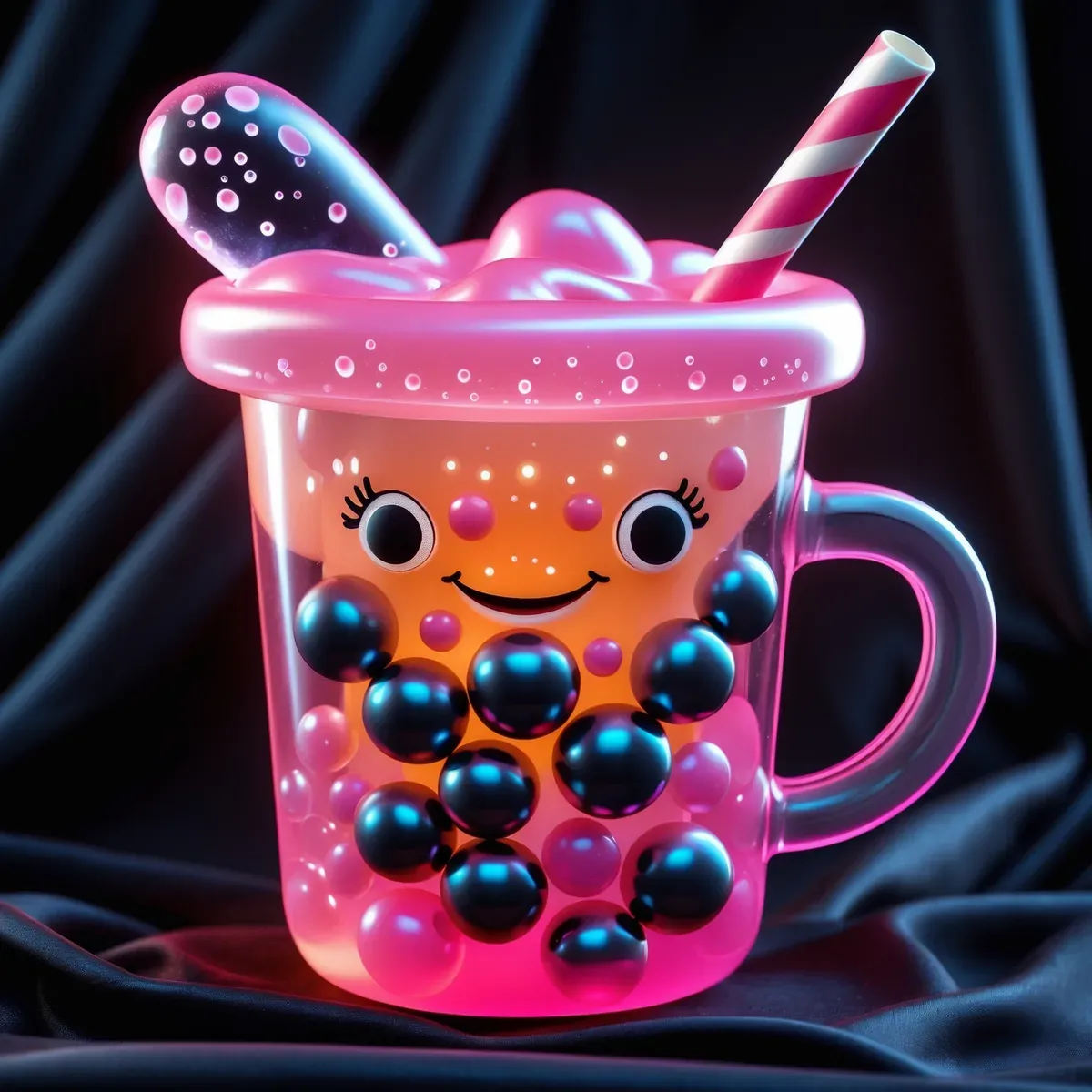
The characters illustrating this article come from Soft Plastic, a set of sixteen we sculpted specifically to test whether the blind-box visual language holds up as apparel graphics. Each one was built around a single mood first and a silhouette second: the storm-cloud bean, the mossy stone golem, the boba jelly, the disco-head. No text, no logos, nothing competing with the figure itself, because the appeal of a collectible has always been the clean read of the object.
If you want to see what else has come out of the studio while this one finishes production, the current catalogue lives here. And if the glossy-character direction is your thing, Munchie Multiverse is the closest neighbour on the shelf right now.
Questions people ask about the blind box aesthetic
What is the blind box aesthetic?
It is the visual language of contemporary designer art toys: rounded bean-shaped bodies, oversized heads, glossy or translucent surfaces, saturated candy colour, and expressive faces that lean melancholy or mischievous rather than simply cheerful. The name comes from the sealed opaque packaging that hides which figure from a series you are getting.
Where did blind box toys come from?
The randomness descends from Japanese gashapon capsule machines, which spread in the 1960s and 1970s. The design credibility descends from the late-1990s designer toy movement in Hong Kong, Japan, and the United States, where artists like Michael Lau and KAWS and companies like Medicom Toy and Kidrobot treated the vinyl figure as an art medium.
Is claycore the same thing as the blind box aesthetic?
They overlap but are not identical. Claycore is a rendering style defined by soft plasticine surfaces and hand-shaped imperfection. The blind box aesthetic is a character-design tradition that frequently uses claycore rendering, along with glossy vinyl and translucent jelly finishes.
Why do so many of these characters look sad?
Because sincerity reads as novel right now. After a long stretch of relentlessly upbeat mascot design, figures that visibly are not coping give collectors something to project onto, and that emotional specificity is what separates a character from a logo.
🎨 Original designs featured in this article are curated by The Design Drop. External photographs and illustrations are credited individually where used.